Chevrolet
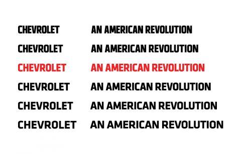
In an effort to simplify and unify Chevrolet’s global branding and marketing, we gave them three things. First, a mandate to use the bowtie symbol bigger, using it alone in the US and move towards that goal in developing markets. Second, and to that end, I drew a more refined, legible, scalable, and slightly more modern logotype. Third, we commissioned Klavika Condensed and prescribed that the resulting super family of type be the cross campaign element around the globe.
Ultimately the success of the guidelines and new tools was limited to adoption. The US marketing firms took almost a year and a half to adopt the simple toolkit—though when they did it was some of their most bold work in memory with dominant typography and even ads without vehicles. Far more eager were the European, South American, and Asian teams, who immediately formed localized extensions of the guidelines and executed strong campaigns for years hence.
My roles—Design, Type Direction