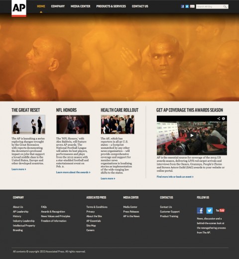
AP Branding
The new logo may feel simple and slightly generic, but it’s concise and strong, especially with the red underscore which I feel will become more identifiable — perhaps almost like National Geographic’s yellow frame — than the “AP” characters.
Overall, I think this is a welcome and positive change that establishes AP as a modern-day news network instead of a relic from the last century.
Armin Vit, Brand New

Launched Spring 2012
My Roles—Design, Creative Direction.
David Jalbert-Gagnier, Creative Direction; Sam Gray, Design.